Brand Identity
Yeka Solutions · 2023 Logo · Visual Identity

Yeka. Brand identity - built for clarity.

A complete visual identity for Yeka Solutions, a software company that needed to feel versatile, approachable, and technically credible all at once.

Year
2023
Role
Brand Identity · Logotype
Tools
Illustrator · Photoshop
Industry
Software / SaaS
Yeka brand identity cover YEKABrand Identity · 2023
01 · The Brief

Simple solutions, clear identity.

Yeka Solutions is a software company that provides versatile, very simple and interesting solutions for business requirements, the brief was to translate that directly into a visual identity.

The challenge was to create a mark that felt both technically grounded and human in its approachability. The identity needed to work across digital products, print collateral, and brand touchpoints.

The process began with understanding what "simple and interesting" really meant in the context of software. Not minimal for its own sake but clear, intentional, and easy to trust.

Every form was stress-tested for legibility at small sizes, across both light and dark surfaces, before a direction was committed.

A brand that feels as reliable as the software it stands for and just as easy to use.
02 · Research & Direction

Understanding the space first.

The software and SaaS space is cluttered with safe, predictable identity, dark navy backgrounds, generic circuit-board metaphors, and rounded wordmarks that borrow from each other endlessly. The audit made one thing clear: the available visual territory was either aggressively corporate or trying too hard to feel "startup-friendly."

Yeka needed neither. The brief called for something versatile and simple, which meant the identity had to earn its simplicity, not default to it.

Strategic direction:
Lead with the mark, let the system do the rest.

Competitors leaned heavily on illustrative icons and busy colour systems. The decision was to go the opposite direction: a single, ownable mark with strong geometric logic, paired with a restrained palette that would feel equally at home in a pitch deck and a mobile UI.

The mood direction pulled from the intersection of technical precision and spatial clarity,think developer tools, not enterprise software. Confident but not cold. Structured but with a human edge built into the form.

Mood ref 01
Mood ref 02
Mood ref 03

One strong symbol, used consistently, would do more for Yeka's recognition than a complex multi-element system ever could.

03 · The Concept

The idea behind the mark.

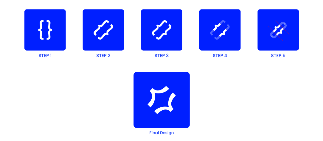
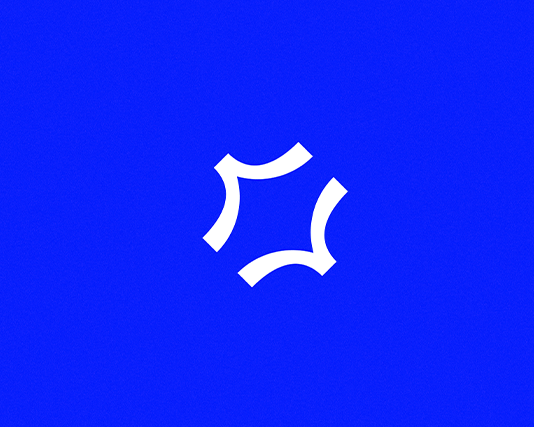
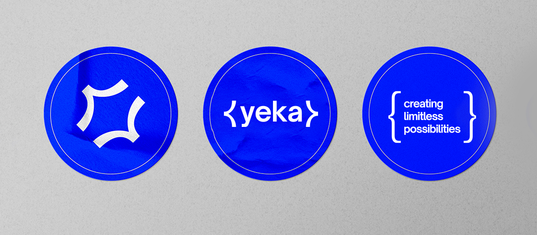
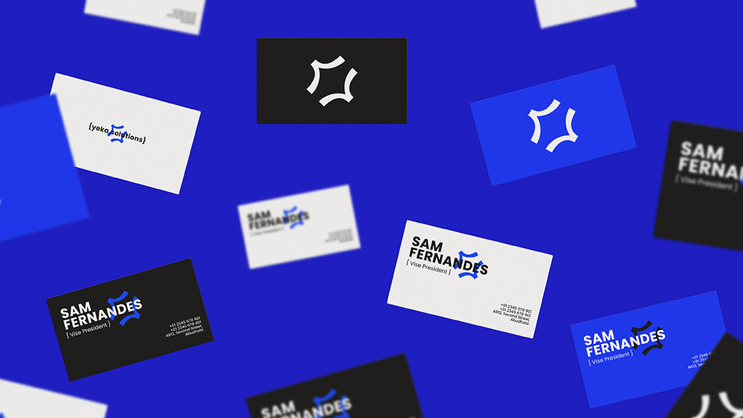
The starting point was the curly brace "{ }" one of the most universally recognised symbols in software development. Every developer knows it. Every codebase is built around it. But using it literally would be too obvious, too expected.

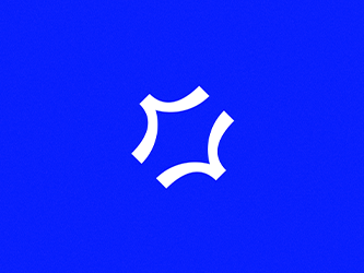
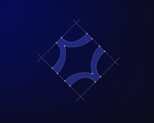
The insight was in the middle: strip away the top and bottom of the brace, and what remains is the center part, the most expressive, distinctive part of the form. Take two of those centres, mirror them, rotate the composition 45 degrees, and something unexpected happens. The symbol stops reading as a bracket and starts reading as a mark - dynamic, balanced, and completely ownable.

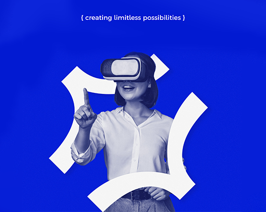
The four curved arms create a sense of connection and flow, like a node in a network or an interface in motion. It suggests both precision (the clean geometry of code) and adaptability (the organic tension between the curves).

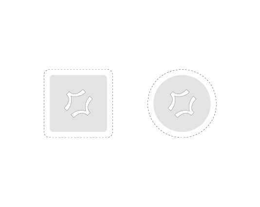
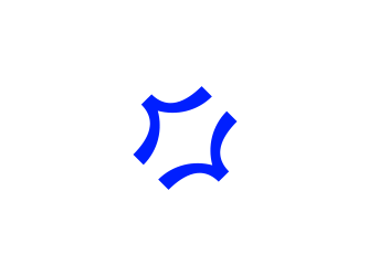
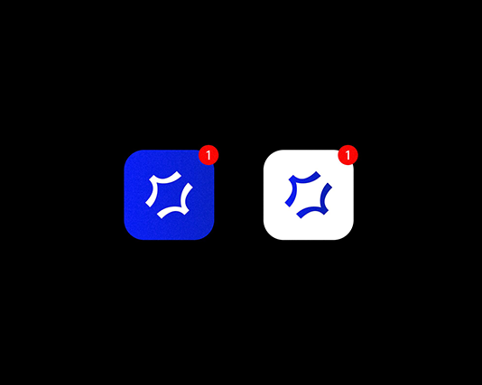
The mark was stress-tested extensively at small sizes. At 16px it holds. Reversed on dark, it holds. Embossed on physical material, it holds. The form is simple enough to survive any context, and distinctive enough to be recognised immediately once seen.

Design process
Step 01
Sketching
Exploration started with the literal { } form, then progressively abstracted, removing terminals, isolating the waist, testing rotations and mirroring combinations.
Step 02
Vectorise
Three directions moved to Illustrator. The mirrored-centre approach was immediately strongest. Proportions refined, stroke weight tested across sizes.
Step 03
Refine
Client feedback round. Curve tension adjusted, rotation angle finalised at 45°, optical spacing corrected at small sizes.
Step 04
Finalise
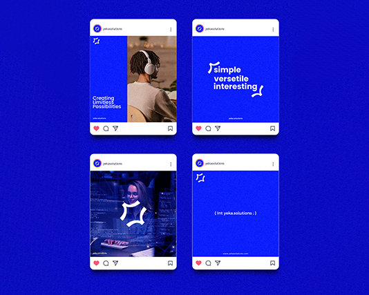
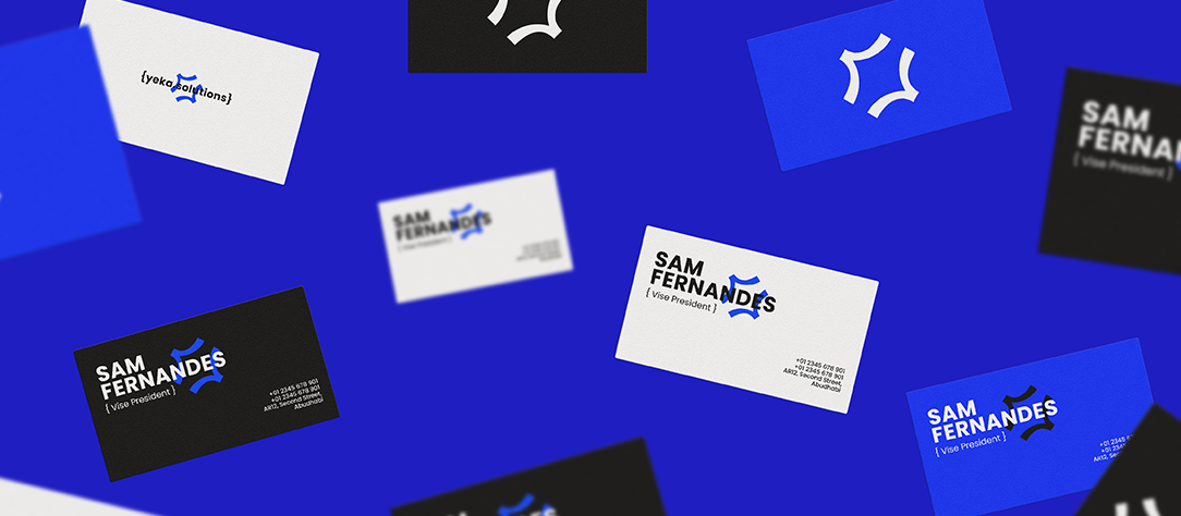
Mark approved. Full system built: colour, typography, lockups, and usage rules confirmed.
04 · The Mark

Logo design, from concept to final.

Yeka logo primary
Yeka logo construction
Yeka logo variations
Yeka logo on dark
Yeka logo mark
05 · Type & Palette

Typeface & colour, to be detailed.

Aa
Open Sauce Sans · Primary typeface · chosen for its geometric construction and clean terminals, which mirror the logic of the mark. Used for the wordmark, headlines, and primary brand communications.
01/06
Open Sauce Sans (lighter weight) · for UI labels, captions, and secondary text. Maintains the technical clarity of the primary without competing with it.
Brand palette
Electric Blue
#1400FF · Primary
White
#FFFFFF
Ink
#1A1A1A
06 · Brand System

Mark, type, colour as one.

The primary lockup pairs the symbol left with the wordmark right, set in Open Sauce Sans at a scale ratio that lets the mark lead. The wordmark is tracked slightly open enough to breathe alongside the symbol without competing with it.

A stacked lockup (symbol above, wordmark below) is available for square format applications, social avatars, app icons, favicon contexts. The symbol alone is used only at sizes where the wordmark would become illegible, typically below 24px.

Clear space is defined by the x-height of the wordmark on all sides. Nothing enters that zone, not in any lockup, not on any surface.

Lockup primary
Lockup reversed
Minimum size / clear space
07 · In Application

Identity across every surface.

Yeka brand application
Yeka brand full spread
Yeka mockup
Yeka mockup
Yeka brand system
Yeka logomark
08 · Deliverables

What was handed off.

A complete brand package delivered to Yeka Solutions at project close.

Logo Files
AI , EPS, SVG, and PNG exports across all variants: primary lockup, stacked lockup, symbol only, wordmark only. Delivered in colour, reversed, and single-colour versions.
Brand Guidelines
A full PDF guidelines document covering logo usage, clear space, minimum sizes, colour specifications , typography hierarchy, and do/don't usage examples.
Stationery
Business card, letterhead, and envelope designed and handed off as print-ready PDF files with bleed and trim marks.
Digital Assets
Favicon (ICO + PNG), social media avatars (square format), and OG image template.
Source Files
Organised Illustrator source files with named layers, separated artboards per variant, and embedded font outlines.
09 · More images

Further exploration.

Yeka brand detail
Yeka brand mockup
Yeka brand final
Brand Identity · 2025

Bakreme Bakes

© Abhijith.Dznr · 2026 Yeka Brand Identity · 2023 meabhijith551@gmail.com