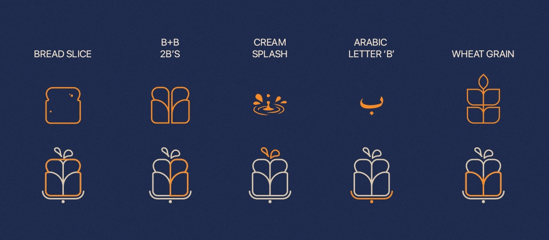
Five directions were explored before the final mark was chosen. A bread slice established bakery territory but felt too literal. The double-B monogram, two interlocking B letterforms, had potential but lacked warmth. A cream splash captured energy but was too abstract for a premium identity.
The Arabic letter B (ب) was explored as a standalone mark, connecting the bilingual identity directly to form. Elegant in isolation, but too narrow without its English counterpart to anchor it.
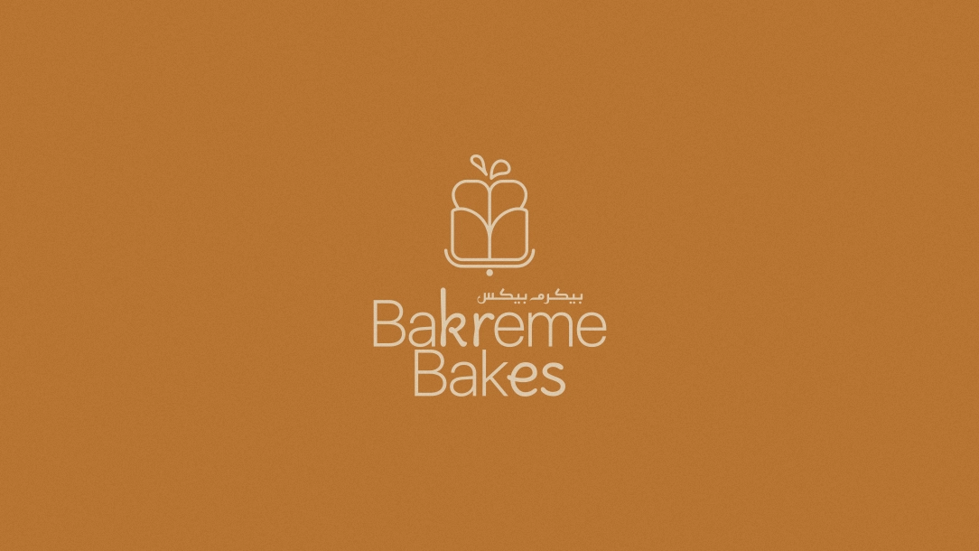
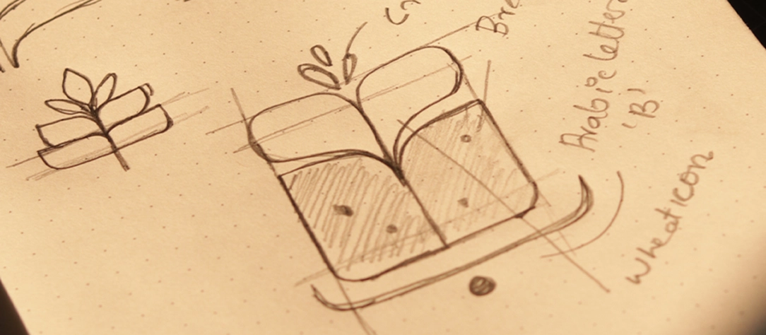
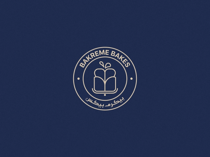
The wheat grain direction unlocked the answer. Its natural segmented form, two rounded lobes rising from a base, had an immediate visual parallel to a gift box. Merging the grain's organic structure with a gift box silhouette gave the mark everything the brief asked for: heritage, occasion, and generosity in a single form.
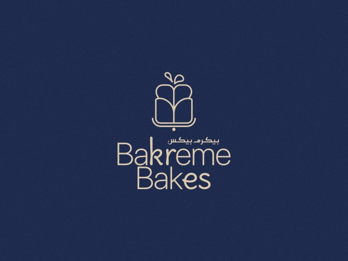
The final mark reads as both a sprouting grain and a ribbon-tied gift, a symbol that carries the full brand promise without needing to explain itself.
Step 01
5 Concepts
Bread slice, double-B, cream splash, Arabic letter B, wheat grain, each tested against the criteria of warmth, occasion, and bilingual legibility.
Step 02
Convergence
Wheat grain selected as the strongest direction. Its segmented organic form naturally mirrored a gift box silhouette, resolving two concepts into one mark.
Step 03
Bilingual lockup
Arabic and Latin wordmarks developed in parallel. Scale ratio between icon and text balanced. Badge and horizontal lockup built from the primary.
Step 04
Finalise
Mark approved across all three colourways. Full system confirmed: colour, typography, clear space rules, and usage guidelines documented.