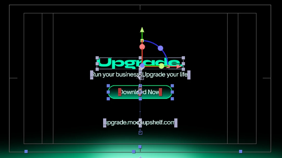
06 Upgrade Motion Graphics Product Video

Upgrade in motion.

A product motion video for Upgrade, an offline-first app for freelancers to track clients, income, tasks and habits. One tab. One place. No subscription.

Year
2024
Role
Motion Design · Animation
Tools
After Effects · Illustrator
Type
Product Video · Promo
01 / Brief

What the video needed to do.

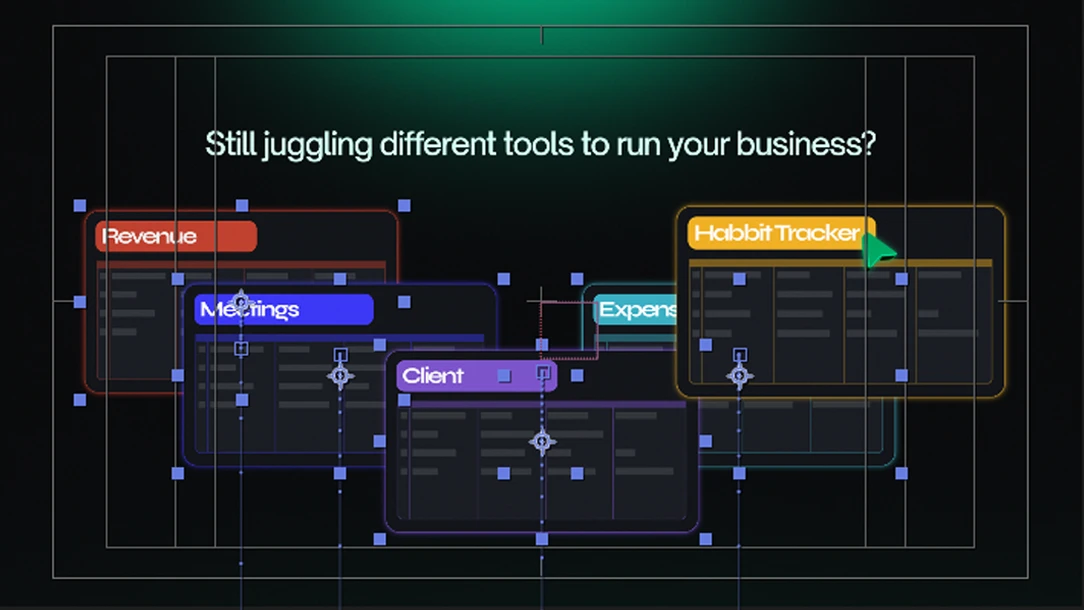
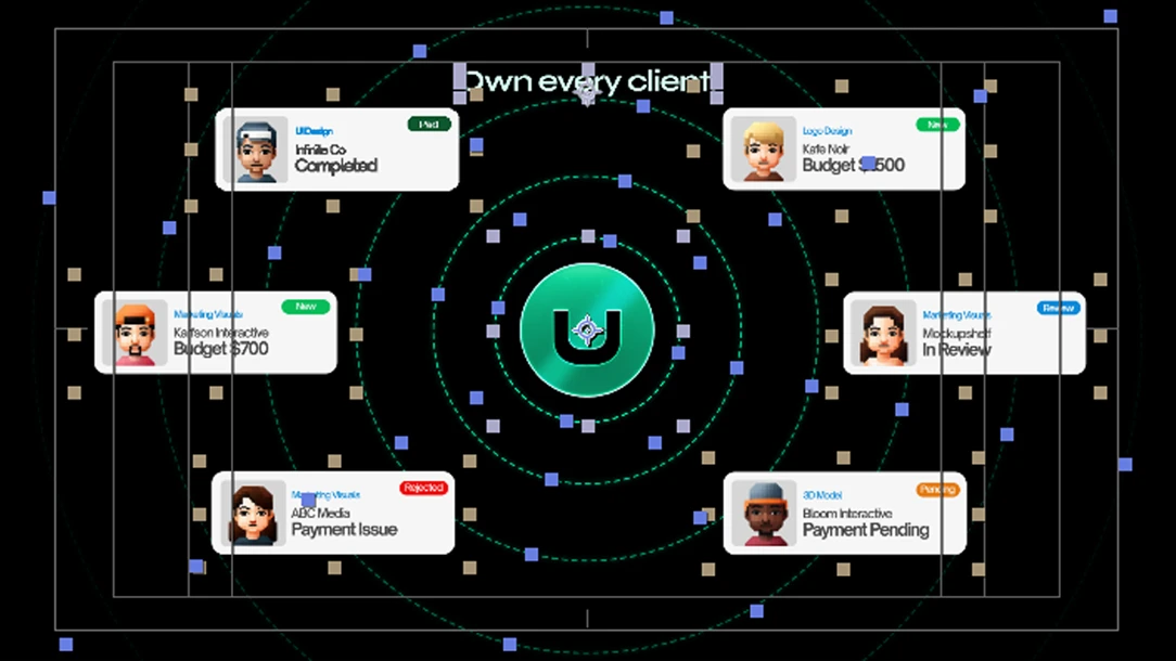
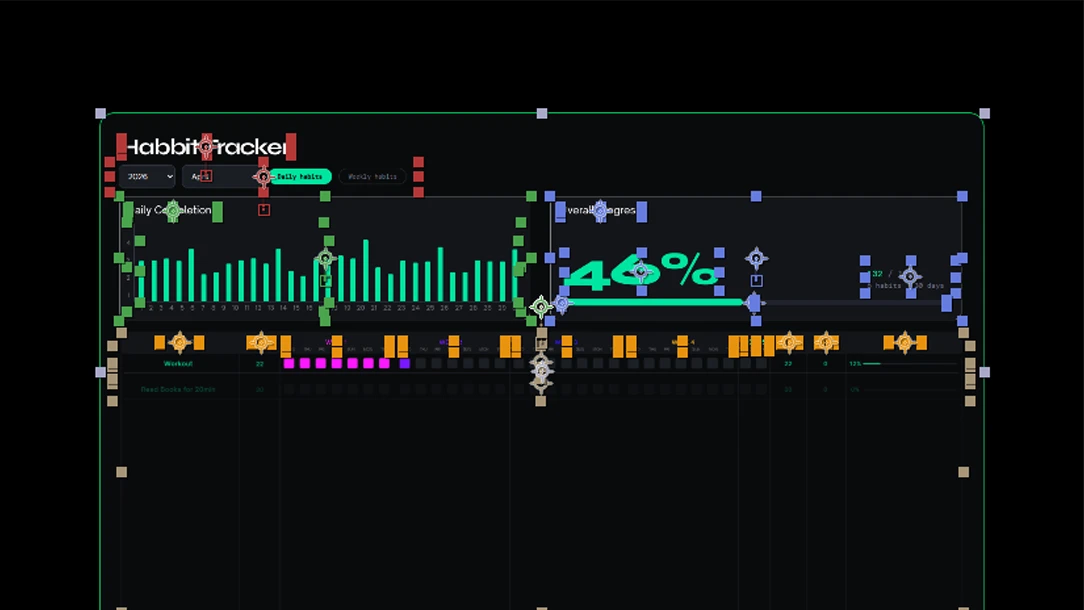
Upgrade is a personal productivity app built for freelancers: a single Notion-style dashboard covering clients, income tracking, task management and daily habits. The brief was to communicate that range without overwhelming the viewer in under 60 seconds.

Most product videos over-explain. The goal here was the opposite: lead with feel, show the interface in motion, and let the typography carry the pitch. No voiceover, no stock footage.

The motion style needed to match the app itself: clean, considered and fast. Sharp cuts, purposeful transitions, and a rhythm that keeps pace with how a freelancer actually thinks and works.

The video was made to sit on the product landing page and social channels, targeting freelancers who feel scattered across too many tools.

"Motion that sells without shouting. Every frame earns its time on screen."
02 / Process

From script to sequence.

Step 01
Script and Flow
Wrote a beat-by-beat script mapping each product feature to a visual moment. Timing planned around a 45-60 second window.
Step 02
Storyboard
Rough frame sketches for each scene: entry, UI showcase, feature callouts, exit. Approved before any animation started.
Step 03
Style Frames
Key frames designed in Illustrator to lock in colour, type treatment and overall visual tone before building in After Effects.
Step 04
Animation and Sound
Full sequence animated in After Effects. Transitions, type kinetics and UI reveals layered, then synced to a backing track.
03 / Style Frames

Key frames, frozen in time.

Style frame 01
Style frame 02
Style frame 03
Style frame 04
04 / Motion Principles

How it moves.

01
Ease and Weight
All elements use custom cubic bezier curves, no linear motion. UI panels feel like they have mass; text feels weightless.
02
Type Kinetics
Key copy enters per-word or per-character with staggered delays. Fast enough to feel dynamic, slow enough to be read.
03
UI Reveals
App UI components slide or fade in sequentially, guiding the viewer's eye to each feature without jumping around.
04
Scene Transitions
Hard cuts between scenes keep pace high. Soft dissolves reserved for breathing moments between feature blocks.
05
Colour Language
The app's own palette used throughout, no extra accent colours introduced. Motion reinforces the brand, not competes with it.
06
Sound Sync
Beat-matched cuts and UI sound design cues align to the audio track. Rhythm ties visual pacing together.
Live product
Upgrade · Freelance OS
upgrade.mockupshelf.com
Visit product

Next project

Meadowside City