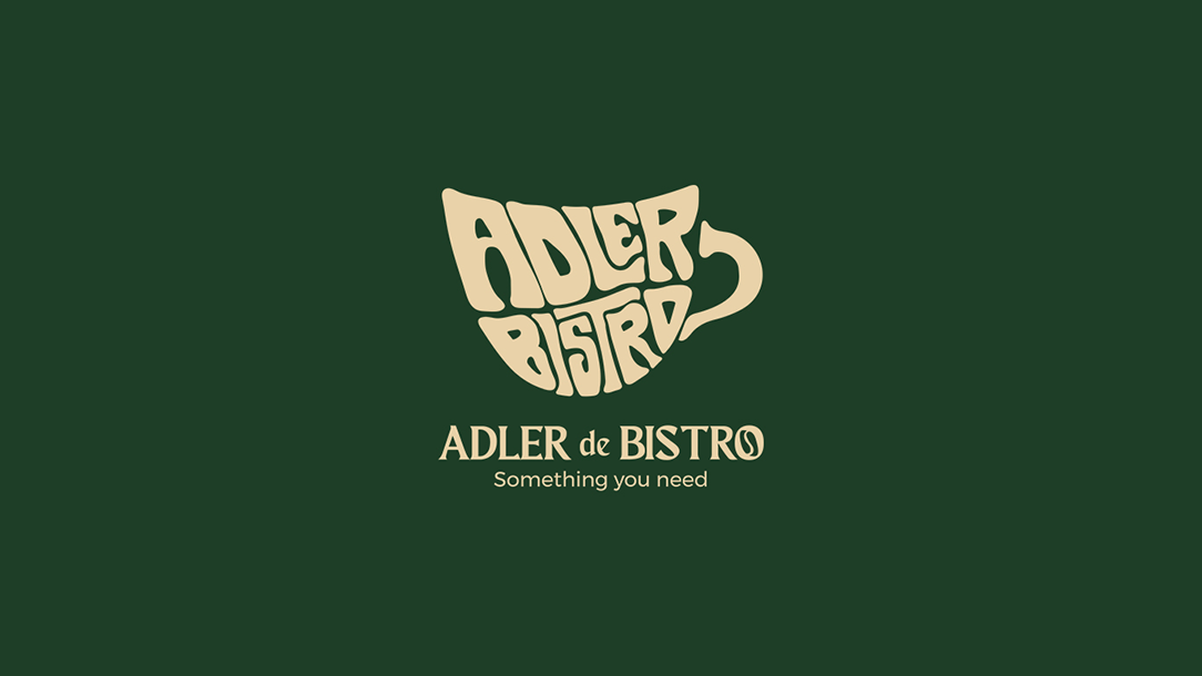
Adler de Bistro.
A custom hand-drawn logotype and mark for a European-style bistro cafe. Built around character, warmth and the quiet confidence of a place worth returning to.
A cafe that needed a mark of its own.
Adler de Bistro is a European-influenced cafe with a personality that sits between neighbourhood warmth and considered refinement. The brief called for a logo that felt handcrafted and ownable. something that could not have come from a template.
The existing visual space for cafe brands tends toward either overly rustic or overly minimal. The goal was to find a third position: expressive but structured, distinctive without being loud.
"Adler" is German for eagle, a name carrying heritage, precision and pride. The identity needed to honour that without leaning into cliche. The mark had to feel earned, not decorative.
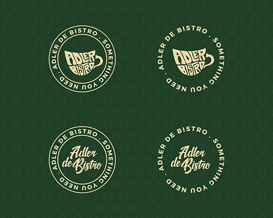
Deliverables included the primary lockup, alternate arrangements, colour variations and a mark usable independently across packaging and signage.
The symbol, up close.

The palette and the letterform.
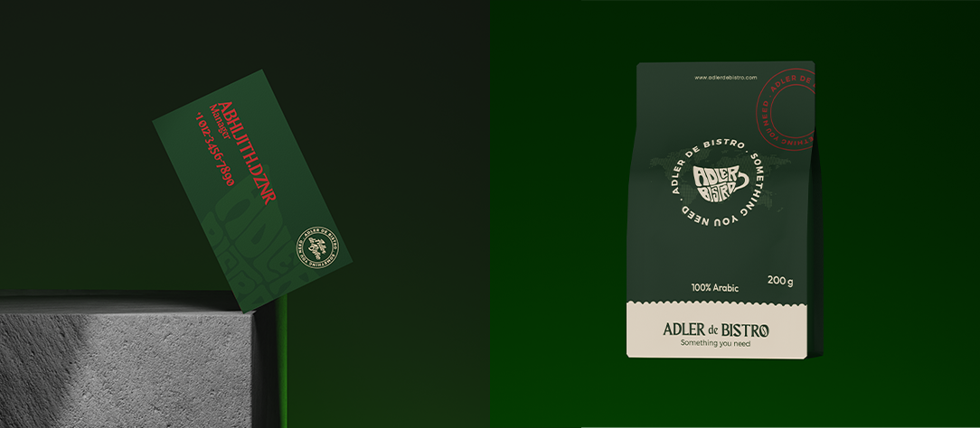
The identity in the world.


What the mark became.
Adler de Bistro ended up with a mark that carries real weight. The hand-drawn quality was preserved all the way through vectorisation, which meant the final lockup still feels like it was built by hand, not assembled from parts. The three-colour system is tight enough to stay coherent across surfaces but warm enough to feel like a cafe. The eagle reference lives in the structure without announcing itself, which was exactly the right call.